
 See My Latest Article on HelloNation
When it comes to fine art printing in Ruston, LA, one of the most important decisions you’ll make is whether to choose a glossy or matte finish for your artwork. This choice impacts not only the visual appeal of your piece but also how it interacts with your space, your lighting, and even your lifestyle. Whether you’re an artist showing work at local Ruston galleries, a collector looking to enhance your home, or simply seeking the right look for a special piece, understanding the differences between glossy and matte finishes is essential.
What’s the Difference Between Glossy and Matte Prints?
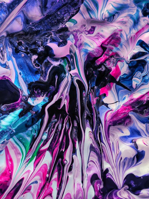
*Glossy* prints have a shiny, reflective surface that gives colors a vibrant, saturated look with deep contrast. This finish often enhances fine detail, making images pop from the page.
*Matte* prints, in contrast, have a flat, non-reflective appearance. The texture tends to soften colors and minimizes glare, resulting in a more subtle, classic look. Matte finishes are often chosen for their sophisticated, art gallery-inspired appeal.
Glossy Prints: Pros, Cons, and Best Use Cases in Ruston
Advantages of Glossy Prints:
- Incredible color vibrancy: Perfect for the bright murals and lively art fairs on Park Avenue in downtown Ruston.
- Enhanced sharpness: Ideal for photographs of Ruston’s picturesque landscapes, sunsets, and historic buildings.
- Appealing shine: Great for commemorative family portraits from college graduations at Louisiana Tech University or local celebrations.
Potential Drawbacks:
- Glare and fingerprint visibility: Glossy prints can reflect Ruston’s strong Louisiana sunlight streaming in through large windows or outdoor exhibitions. They also easily show smudges in high-touch areas.
Best Use Cases in Ruston:
- Modern homes with controlled lighting.
- Art meant to grab attention in restaurants or businesses featuring Ruston artists.
- Gifts and photo albums that are handled less frequently.
Matte Prints: Pros, Cons, and When They Shine in Ruston
Advantages of Matte Prints:
- Reduced glare: Matte finishes won’t reflect the plentiful Ruston natural light, making them ideal for well-lit homes or outdoor events like the Dixie Center for the Arts’ sidewalk expos.
- Subtle, tactile feel: Matte paper brings out the texture of painting reproductions or soft pastels—perfect for displaying classic southern landscapes and portraiture.
- Resistant to fingerprints: Great for children’s art in local schools, interactive museum displays, or anything that will get plenty of hands-on attention.
Potential Drawbacks:
- Less color pop: Matte prints can look a bit subdued compared to glossy, which may not suit the vibrant style of some regional artist collectives.
- Slightly muted details: Fine details might not appear as crisp, which should be considered for detailed photographs or intricate illustration work.
Best Use Cases in Ruston:
- Framed artwork in bright homes or public spaces.
- Traditional and timeless pieces for church foyers or gallery shows.
- Prints meant for tactile engagement, like those at Cedar Creek School’s art program displays.
Factors to Consider When Choosing Your Art Print Finish
Each Ruston home, business, or gallery has its unique character and lighting situation—as do the tastes and needs of the art community here. Here are some tips to help you decide:
*Lighting Conditions*
Consider the amount and type of light in your display area. For spaces with direct sunlight or strong artificial lights, matte is often better to avoid glare. For spaces like cozy coffee shops or rooms with soft lighting, glossy gets a chance to shine.
*Artwork Style*
Modern photography, digital art, and vivid abstracts are often enhanced by glossy finishes. Traditional paintings, watercolors, or works inspired by Ruston’s earlier artistic movements might look better in matte, emphasizing nuance and subtlety.
*Usage and Handling*
If your print will hang in a frequently used hallway, school, or community center, opt for matte to reduce maintenance. For showcase pieces displayed behind glass, glossy becomes less of a fingerprint concern.
*Framing Decisions*
Pairing a glossy print with a glass frame can double the potential for reflection, while matte prints behind glass remain subdued. When showcasing at Heritage Hall, for instance, balance the finish with your choice of framing material.
What Ruston’s Art Scene Can Teach Us
Ruston’s vibrant art scene, from Art with a View atop the historic Fire Station to student-led exhibitions on Tech Drive, shows the diversity of creative expression in our community. There’s no one-size-fits-all answer—some artists coordinate finishes with their subjects or spaces, while collectors curate based on what works best in their architectural environment.
Talk to local printers and gallery owners; they’ve seen what works and can guide you based on your specific project. Attending local shows and noting which finishes catch your eye can be a helpful way to start making decisions for your own space.
Final Thoughts: Which Is Right for You?
Both glossy and matte finishes have their place in the world of fine art printing, especially in a community as artistically rich and varied as Ruston, LA.
- Choose *glossy* if you want bold colors and dramatic visuals, and glare or fingerprints won’t be an issue in your display area.
- Opt for *matte* to avoid reflections, minimize maintenance, and achieve a classic, understated elegance.
Ultimately, the best finish is the one that matches your artwork, environment, and personal style. Experiment, ask for local samples, and trust your eyes—because in the end, that’s what makes your art truly yours.